Solaris has a bright colour palette that reflects our principles. We have selected a large series of colours to help support each of the different sections of Codebots. To help us achieve harmony and consistency across our many products we have created a flexible system that ensures users always know where they are.
Our palette is made up of our Primary, Brand and Support colours. Each of these have been selected for their warm or bright nature and high contrast rating. Since Codebots is a primary digital brand pushing a digital product and agenda, we opted to use colours that may not be CMYK friendly and have provided an alternative print colours that evoke the same feeling.
Our primary colours are our content first colours. These are the two most used colours across our brand. These should only be ever used as either background or text/ icon colours. They should never be used as a supporting colour such as in a header or infographic.
For subtle changes in the background and to denote the concept of hierarchy in the design, we have a 7 point grey scale. The grey scale should only be used in digital mediums, never in print.
Solaris’ brand colours are what we promote out to to the world as being the essence of Codebots. They help reflect the bright and energetic nature of our company. Stepping away from the standard darker tones of the market. We believe in a bright future where bots and humans work together in a digital frontier. These colours should be used sparingly in the products as to not dilute them. However, they should feature where the primary focus is our brand, such as the marketing site.
Our brand colours should only ever sit next to each other when directly referencing the brand.
In order to give life and a vibrate brightness to our brand, we have opted to include a series of secondary support colours. These colours are designed to support different content, while not representing the brand by themselves.
Solaris also has a number of gradients to help with the visualisation of data. We tend to only use this in progress, data vis and content related designs. They should only be used on digital products.
Solaris has two themes, a light and dark version. These themes are designed to help creators provide the correct experience for a situation. We preference the light theme for most use cases, however when eye strain needs to be taken into account we recommend the dark theme. Each theme is centred around the primary background colour of either the Primary or Secondary Solaris colours.
Our light theme is our default theme and is designed to evoke the sense of brightness and excitement. It uses the Secondary - Light as its background and makes uses of the lower end of the grey scale.
The dark theme is our alternative theme for our diagram editor and when we want to really put emphasis on our colours. It uses more of the higher end of the grey scale than the light theme with some support colours being replaced entirely by the grey scale.
Solaris uses four alert and notification colours. These should remain the same colours regardless of the theme and always mean the same thing.
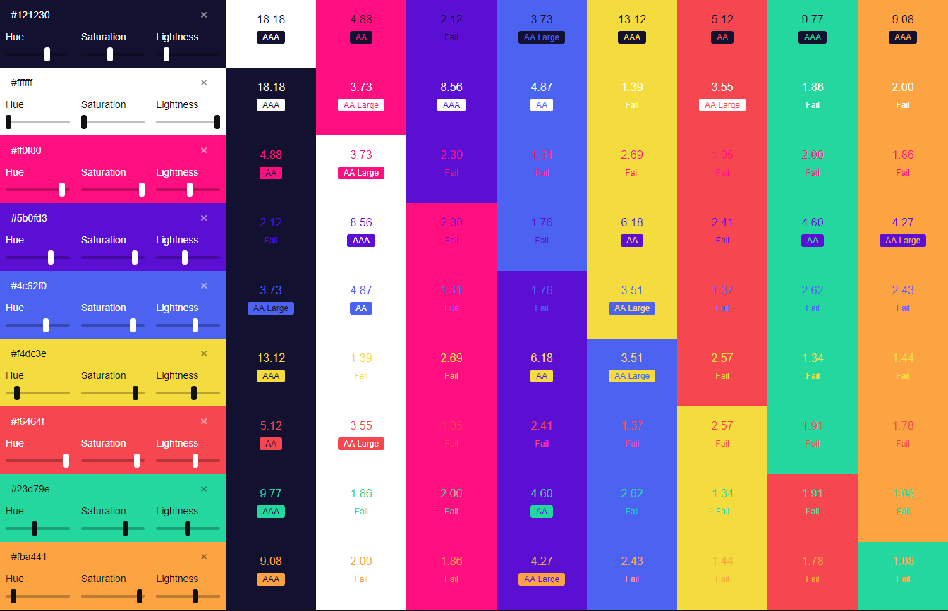
Solaris strives to maintain a high level of accessibility. Our colours have been designed to provide a AA or AAA contrast rating for all content. In order to meet this, we need to alternate the primary and secondary colours when used on the brand and support colours.
Do not use a brand or support colour as content on another brand or support colour, ever.