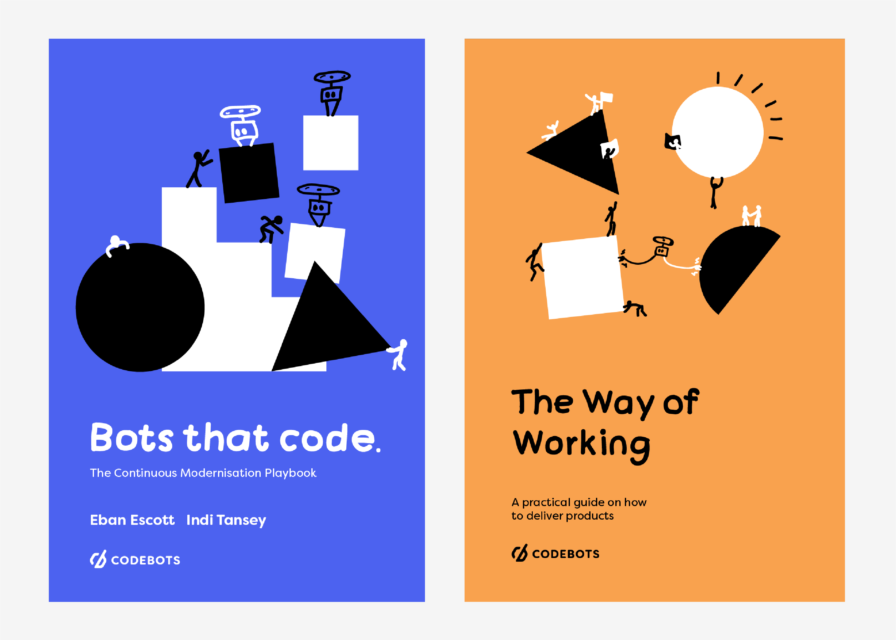
Illustration
At Codebots, illustrations are used within our blog to support ideas and concepts. To get the feeling of fun and creativity, we have a chosen to use a very sketchy and rough style of illustration. These doodle like drawings help to convey the meaning of rapid creation.
The combination of clean, vector drawn geometric shapes, and quick, doodle-like sketches represent the merging of humans and technology. Shapes represent the bots and doodles represent the work of humans.
In the majority of our illustrations, a basic shape or series of shapes should make up the foundation of the illustration. Sketches can then be added to convey the message of the content that the illustration is attached to.
Use of colour
Brand and support colours should be used to fill shapes or as a solid background colour.
Codebots Void #121230 or Light #ffffff can be used as background colours. If void is used as a background colour, then brand and support colours can be used to fill in the shapes, and the figures should be drawn in white to contrast the dark background.
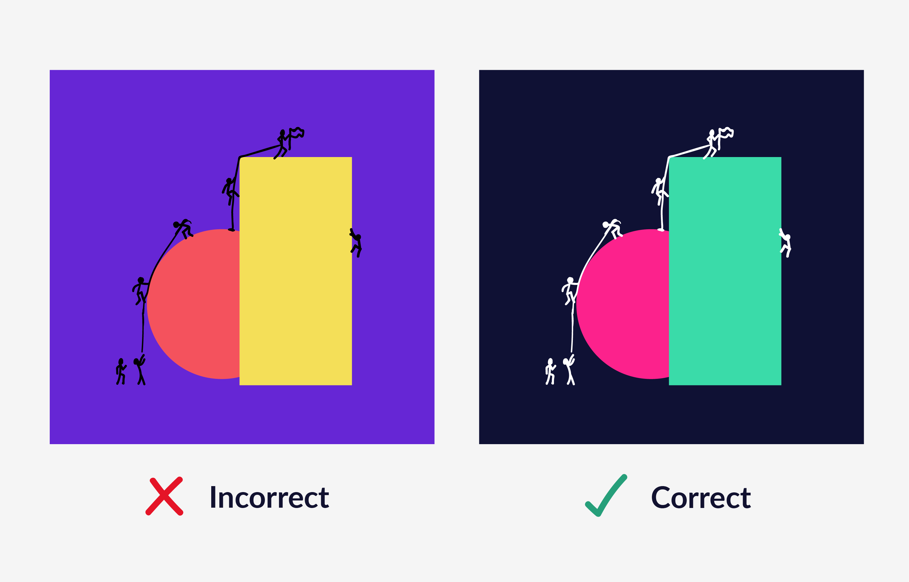
If a brand or support colour (refer to colour chart) is used as a background, shapes and figures must be filled in black or white, and contrast with the background colour.
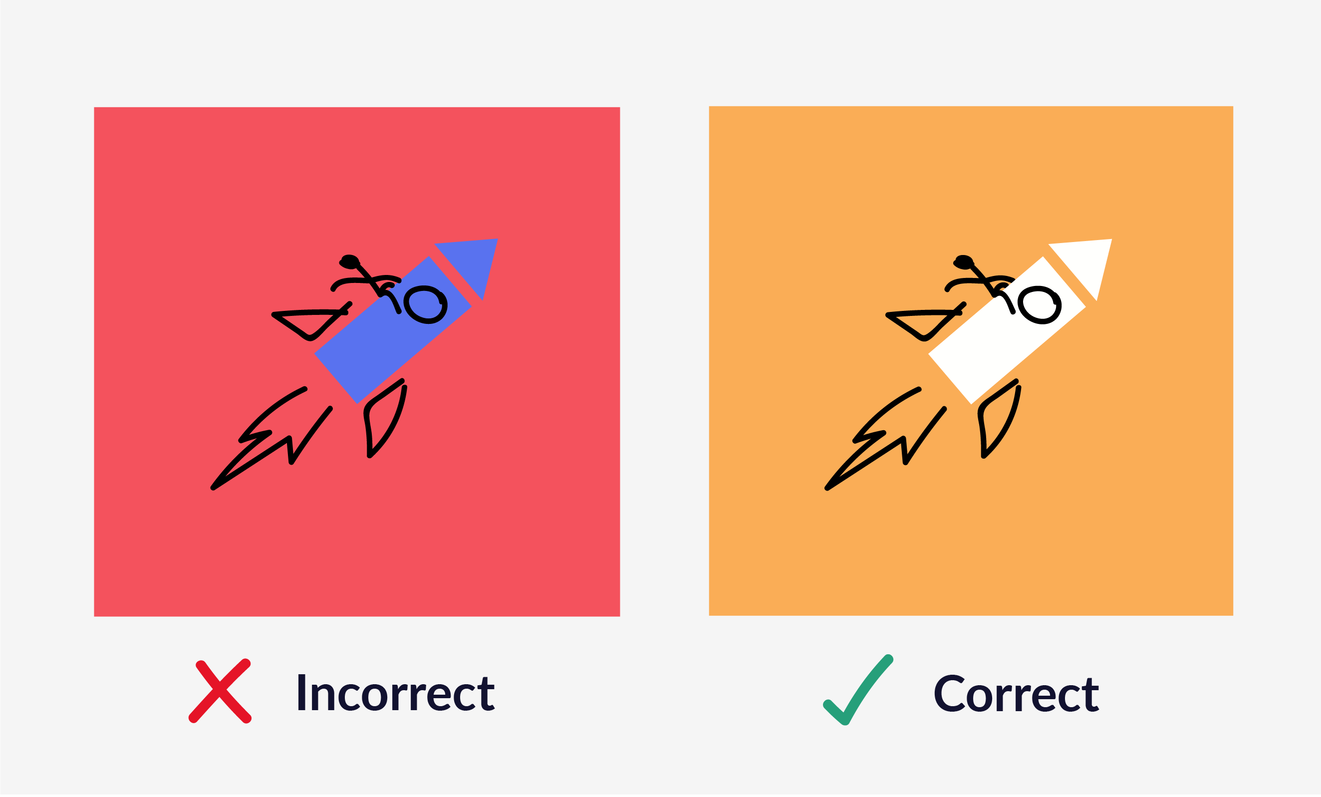
Two objects of the same colour should never overlap, and overlapping shapes should be of high contrast.
Strokes
We use a brush which can vary in weight ever so slightly to create a sketchy look. A thicker or thinner stroke may be used dependent on the scale of the illustration, however the stroke thickness should stay consistent throughout each illustration. We use a rounded cap and corners at all times.
In most cases, on a white or light background #000000 should be used as the stroke colour. On dark backgrounds, #ffffff should be used as the stroke colour to create contrast.
Before finishing an image, ensure all outline strokes are expanded into shapes so that they are scalable.
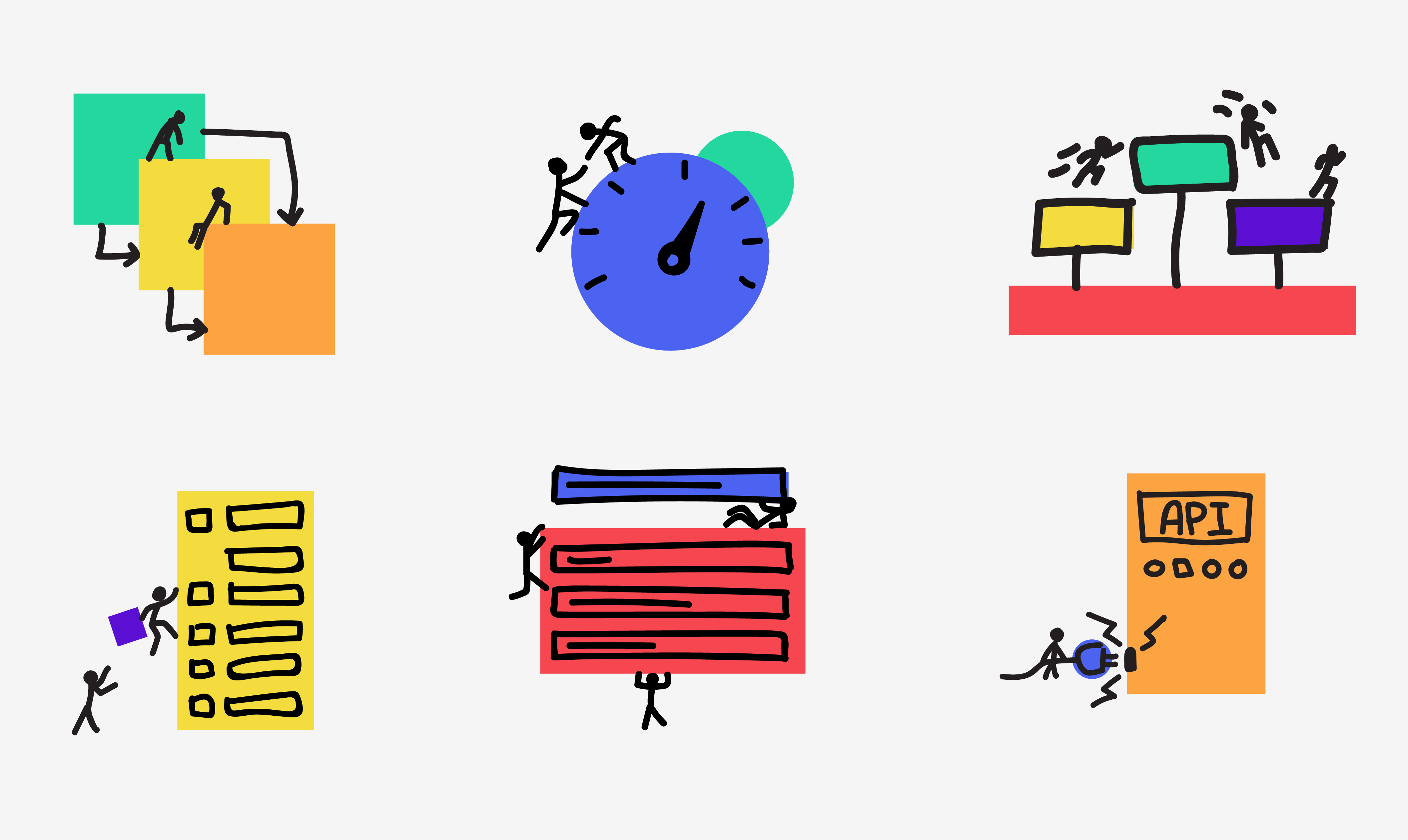
Stick-people
Stick people are the illustrations we use when the emotions of a peg-person aren’t required or the illustration size is too small for details. They are used to denote action and bring a sense of fun and human touch to the illustration.
Anatomy
The stick-people are very basic to draw and have only a couple of rules to them.
- The arms should always be roughly the same length as the torso or slightly shorter.
- The arms should always start just below the head, there should be no neck visable.
- The legs should always roughly be the same length as the torso or slightly longer
- The head should be within proportion to the rest of the body and not overly large.
- The arms, legs and torso should be bendy instead of angled.
Shapes
Shapes should be the base for all illustrations, and are simple vector drawn shapes, filled in with a solid colour. Illustrations can have a single shape or multiple shapes.
Types of Illustrations
There are a variety of illustrations that we implement into our brand. Take a look below to see which illustration suits best.
Support Illustrations
To support ideas and concepts we use a combination of shapes and sketches.
Use a basic shape or series of shapes to help define the foundation of the illustration. Then add sketches to the illustration of convey the message of the content.
The viewer should feel a sense of teamwork, adventure, achievement, and optimism. For example, a team of figures could be working together to build, fix, and assemble something.
Pictograms
Pictograms are used to represent content in the same way as icons are. However they are more focused on the visuals and less the quick reference guide. They follow the same pattern as the supporting illustrations.
Infographics
Infographics focus on the content and the message trying to be displayed. They use both the shapes and sketches to help support the idea. For mass print, stick to a standard tricolour scheme, while everything else utilise the brand colours to convey meaning where necessary.