Logo
The Codebots logo was born from the shape of our bots and its letter marks. It is a coming together of humans and bots to create something new and vibrant.
Types
Where ever possible, use the Inline logo as a primary indicator of the brand. This aligns with other members of the ECI family. It is designed to work as a duotone on white backgrounds and as a solid mono colour on dark backgrounds.
Inline
The inline logo is the preferred display option when possible.

Stack
The stack logo is designed for use in vertical situations where a horizontal logo would be too small.

Mark
The logo mark is designed for use when the word ‘Codebots’ is used somewhere else to denote it as part of the brand. It should never be used by itself when the context of the brand is ambiguous.

Colours
The logo colours are an important part of the visual design of the brand. It is important to ensure they shine through.
Light
While on a dark background, the logo should have a high contrast with the use of the mono tone light colour or duotone.

Dark
While on a dark background the logo should have a high contrast with the use of the mono tone light colour or duotone.

Mono
The mono tone logo is the primary logo to be used when in a productive sense or on a dark background. The mono tone logo is either split between the sol and light, sol and void or just void or just light. No other colours should be used.

Duo
The duo logo is our primary brand logo and should be used where possible. It consists of both sol and luna.

Spacing
Spacing the logo is an important part of ensuring its readability. Ensure that these rules are always met.
Layout
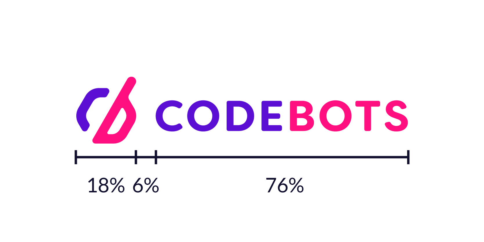
The logo should always be used as an SVG, PNG or WEBP. If you need to work with the vector file, then ensure that these ratios are met.

Clearance
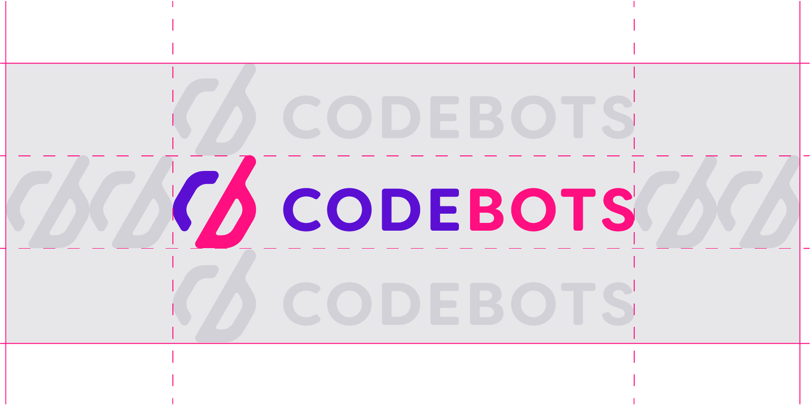
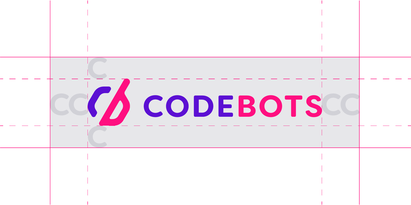
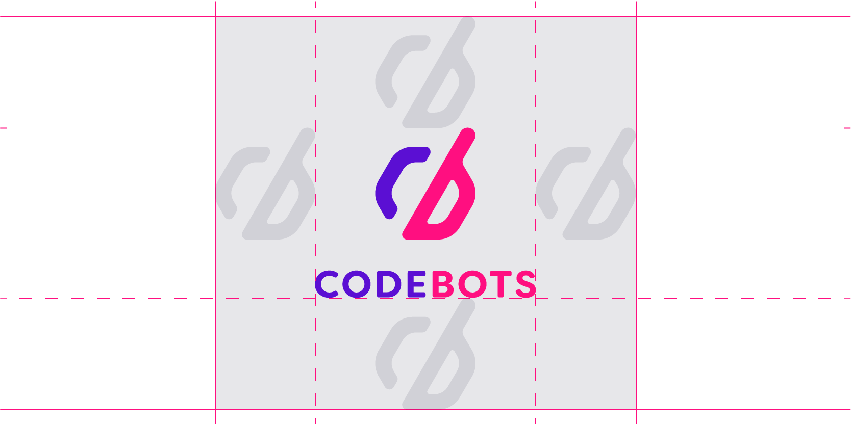
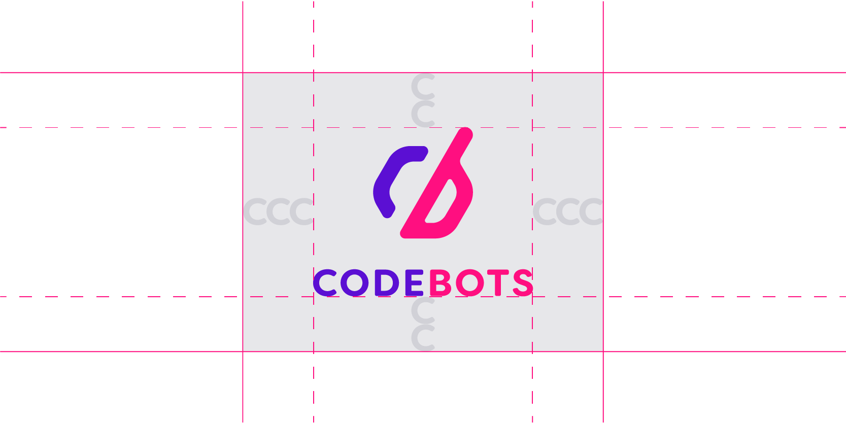
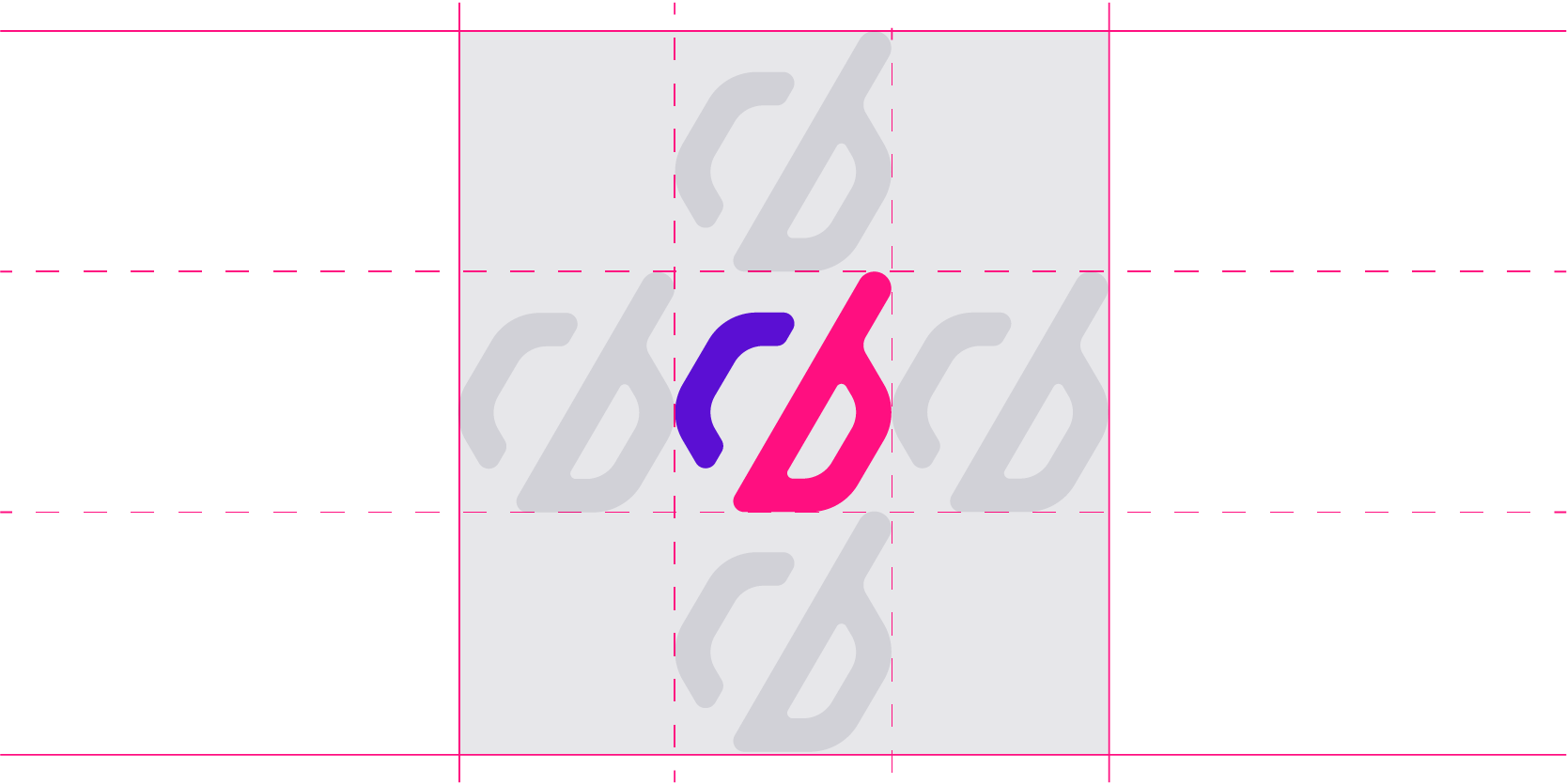
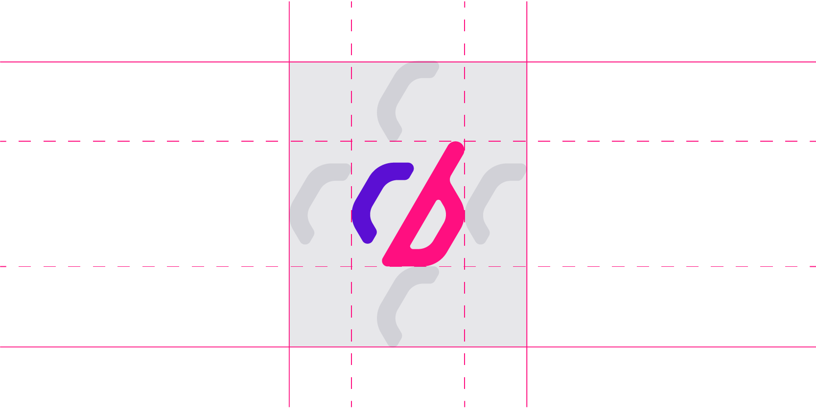
The logo should always be given a 1:1 ratio of clearance around it with other elements. These are presented as an ideal clearance and a minimal clearance.
Alignment
The logo should always adhere to these alignments.
Size
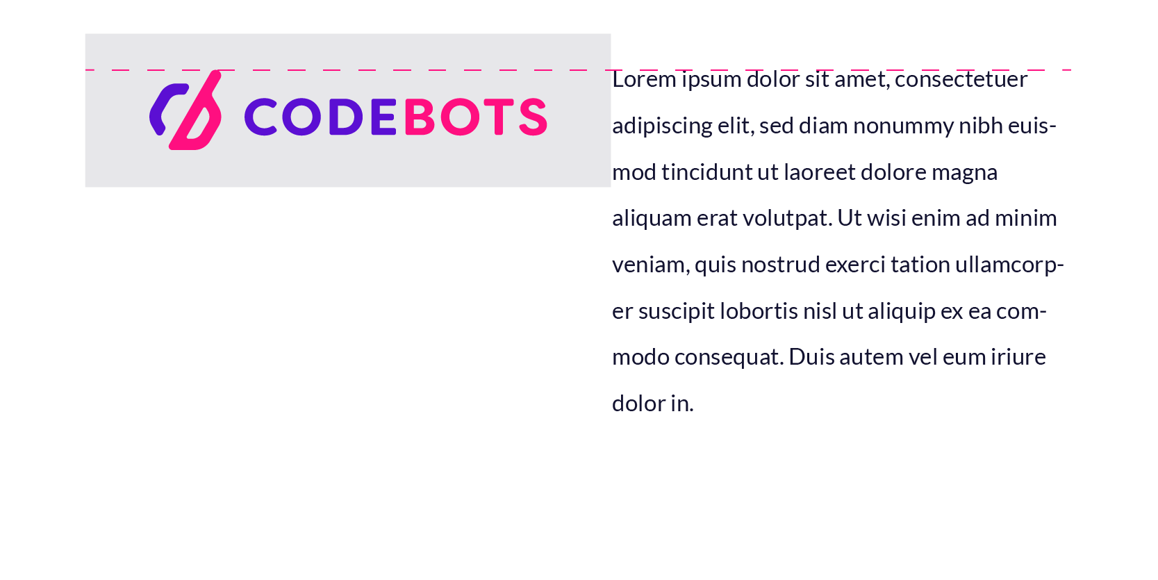
The logo should always be legible and readable.


Usage
The logo should NOT be used in the following ways.
Resize
Never resize the logo, always use it in its proper dimensions.

Effects
Never apply any effects such as drop shadows to the logo.
Low contrast
Always ensure that the logo meets the contrast requirements.
Pictures
Never use the logo on a heavily detailed background.

If you must use the logo on a picture background, ensure that the logo meets contrast requirements, normally by using a mono colour logo. Ensure that the logo is on a single coloured part of the picture and have a darkened overlay between the layers.

Colours
Never use the duo logo on anything but white or black/void. Never change the colours of the logo to another support colour.

If you want to use the logo on another colour, then stick to these contrasts.

Orientation
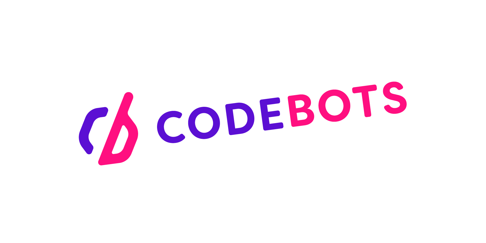
Never display the logo at an angle.
Patterns
Never give the logo a pattern.

Crop
Never crop the logo.

Outline
Never display the logo as an outline. Always use a mono tone instead.
